Rural Directions Brand Refresh
May 2024
It’s out with the old and in with the new as Rural Directions rolls out our refreshed branding this month. The time has come for us to modernise and evolve our brand in preparation for a huge milestone in 2025, where Rural Directions will celebrate our 20-year anniversary!
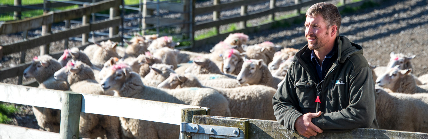
Over the years we have maintained our grounded values in on-farm recruitment & HR, however, more recently have expanded our focus reaching further beyond the farm gate. Rural Directions are the leaders in recruitment and HR across the primary sector supply chain, from the ranges to the port. We are committed to all levels of the sector and work throughout New Zealand.
New Zealand’s primary sector is quickly evolving into a modern, technology-driven industry and we felt it timely to reimagine our branding to better represent our people, our place, and how we help careers and businesses grow.
Our new branding represents a fresh Rural Directions with a clean, modern typeface and a deeper story of our service and our roots told through the curved symbolic RD emblem. Within this we see a path leading to a crossroad, symbolising the career paths and opportunities we facilitate. As a proud Hawkes’ Bay, New Zealand business, a koru shape within this emblem symbolises our anchor to the land and its history. The soft orange curves take inspiration from the undulating earth our industry is rooted in, and the upward ’tilt’ of the emblem – like a tilted map – draws the eye upward, forward, onward towards a new direction.
Our brand evolution includes how we do business, the systems we deploy, our people, the knowledge we impart and the outcomes we drive for your business and ours.
We are proud of our brand and excited by the positive feedback we have received to date.